Comparing the Design and its Realization
October 12, 2017

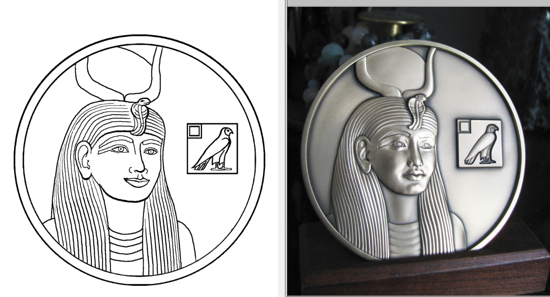
Hathor side...(Medals are three inches in diameter)
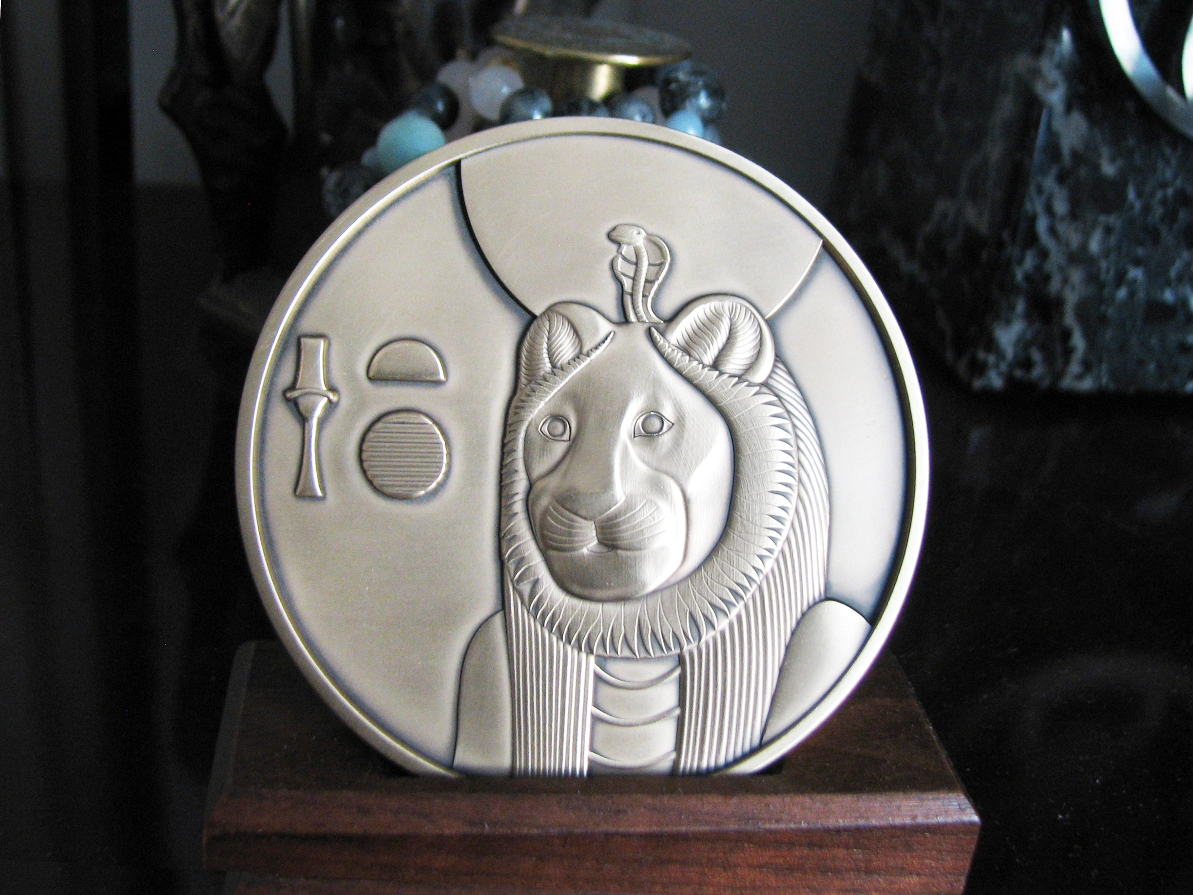
Sekhmet side...
A plan has been realized! The idea began during the Festival of the Beautiful Reunion last June. Inspired by Julia's gift to me of a coin featuring Anubis (Yinepu), and subsequent research into its designer and the medallions she crafted, I designed two rounds featuring Hathor and Sekhmet.
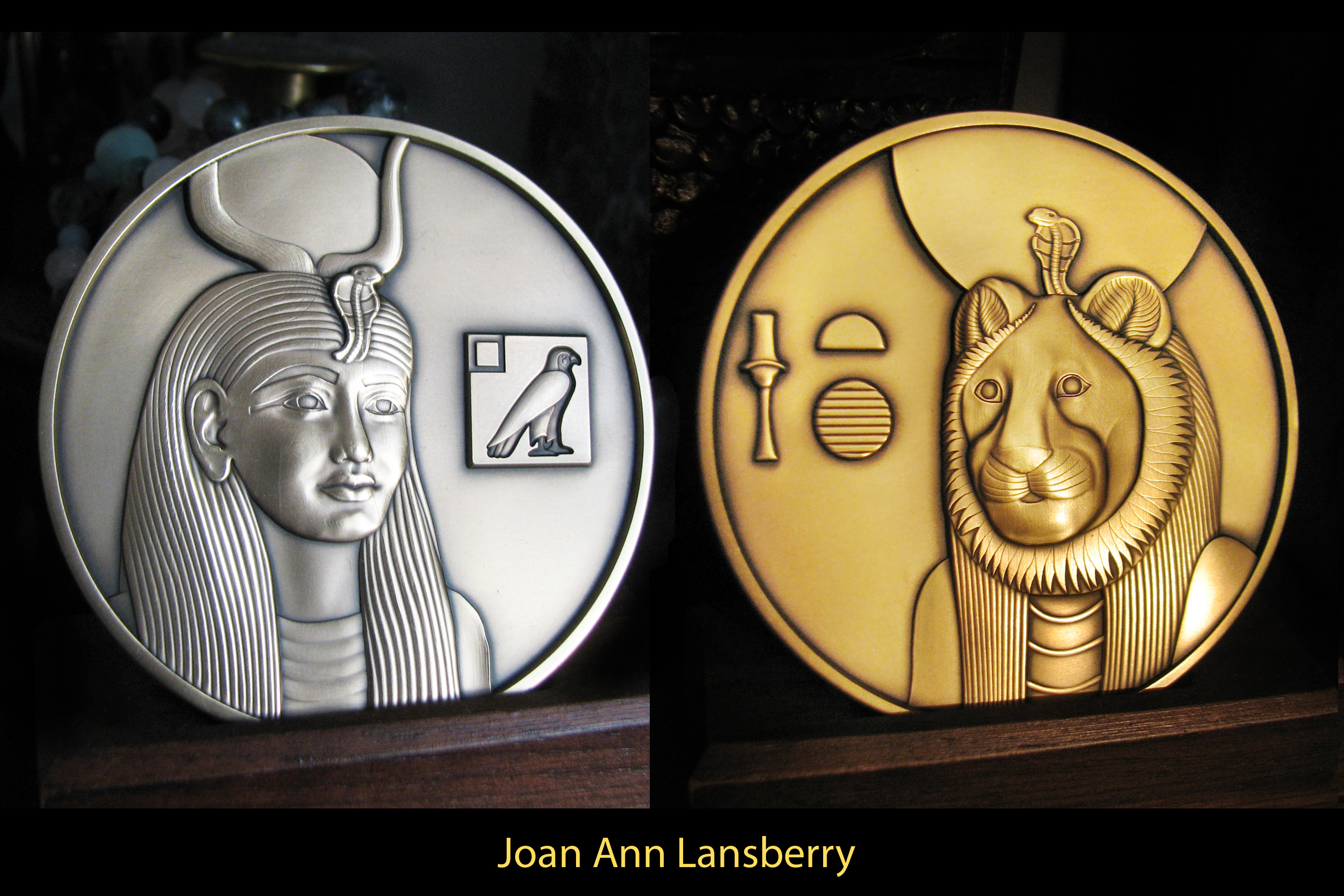
Another view of the Sekhmet side. The true color is a gold patina, somewhere between these two views.
I first started with the drawing of Sekhmet. I used museum photos of two different statues of Sekhmet at the Met museum. One had the right angle I wanted, but it lacked a crown and uraeus, so I consulted a different statue's photo to get those. Once I got Sekhmet drawn, I started on the drawing of Hathor. I used photos of her statue at the Turin museum for guidance. That statue of Hathor has a damaged uraeus, so I was able to flip the uraeus from the first drawing and adapt it to this drawing.
The idea is that the two deities are "two sides of the same coin", gentle Hathor can become fierce Sekhmet, fierce Sekhmet can become appeased and soften into gentle Hathor. The designs are such that the eyes of each deity are exactly placed to be in the same spot on either side.
I found it fascinating to compare the medal design and its realization. I think the mint used a digital three-dimensional creation program, unlike the more traditional method of creating a very large clay model.
(Heidi Wastweet shares the traditional method via this link.)
It's interesting to see what lines their artist kept, unaltered, except for the shaping.
The Hathor side seems mostly unchanged, except their artist greatly refined her mouth:
The Sekhmet side got more refining:
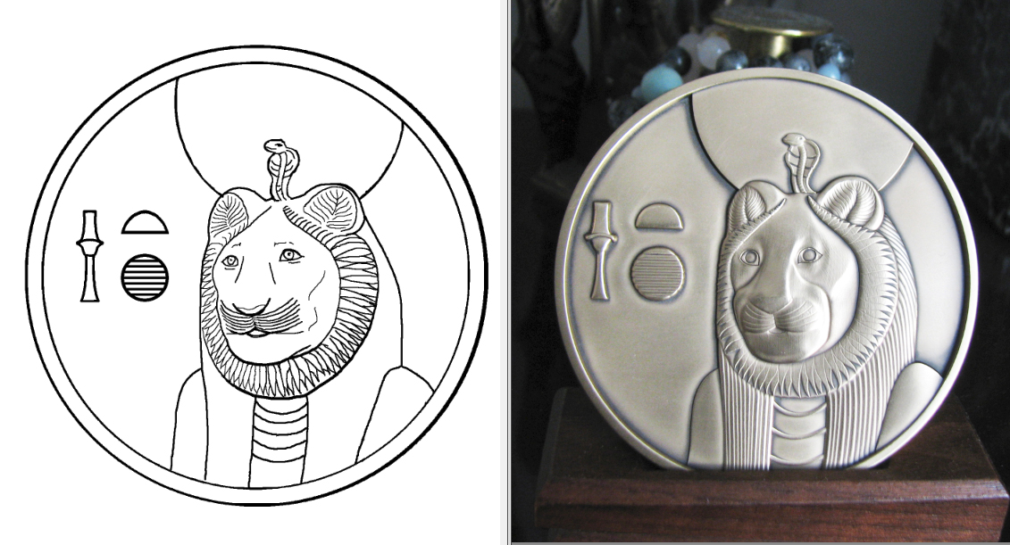
The artist added hairlines, (which I forgot), and did a different thing with the collar, which makes a better contrast. Also, the hieroglyphs seem a bit larger and nicer.
|