Roughly, the conclusion is that experience of color is in the mind, but there are objective things in the world that bring about that experience.
"Two central facts show that color perception is more than wavelengths.
1. Color constancy is the fact that colors are perceived to be the same despite changes in wavelength.
2. Color contrast is the fact that colors depend on contrast in context...."
Almost everything of our color experience is 'in context'. Part of it is wavelengths. Things reflect the colors of things around them. Nothing demonstrates this so well as these two photos I took at the Brooklyn Museum:
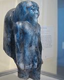

Old Kingdom Gneiss Statue, Fertility Figurine


|
Color Balance Color Levels: -10, 0, +10 Cyan ----------||-------------- Red Magenta ------------||------------ Green Yellow --------------||---------- Blue |
As you can see, my adjustments make it 'truer' to the native coloring:


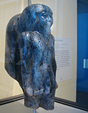
Photo at far right is raw from the camera, without editing.

Photo at far right is raw from the camera, without editing.
That is normal 'context based' color experience, for everything around us is absorbing reflective color from nearby objects. For instance, you've heard of the eyes that look blue or green, depending on what the person is wearing. But the context can go beyond the normal, to become strange and illusionary. I learned from the _Philosophy of Mind_ course of an intriguing website featuring all sorts of illusions. The following illusion had me boggled. I did not believe the color of the axis point link was the same, nor the angles all ninety degrees:

This is from a screen capture... (Actually, a screen capture of a screen capture)
...as is this 'mask revealed'.

Even though I 'know' they're both gray, one still looks blue and one still looks yellow.